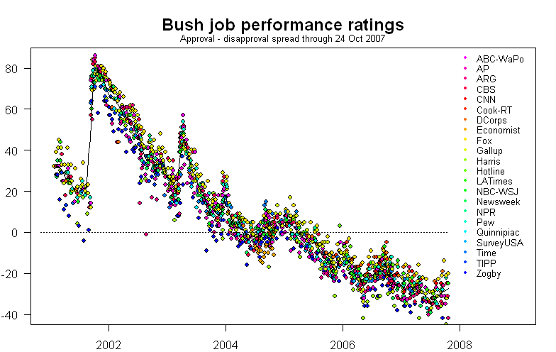
During the hiatus of the redoutable Professor Pollkatz, I continued his tracking of job approval ratings for the President. Below, you can see a graph that tracks the spread between job approval and disapproval ratings, based on data available at PollingReport.com. Superimposed on the plot is an average of all 14 polls in this data set.
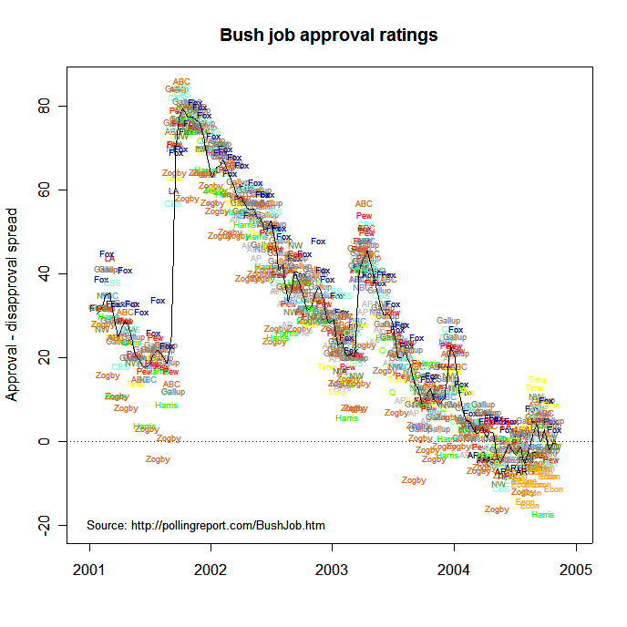
Here is the same plot, with the same average line, but with each poll labeled.
The next plot looks at the difference between each poll and the average. This plot makes clear that the Fox poll tends to "favor" the President more than the poll average, while the Zogby poll leans the other way.
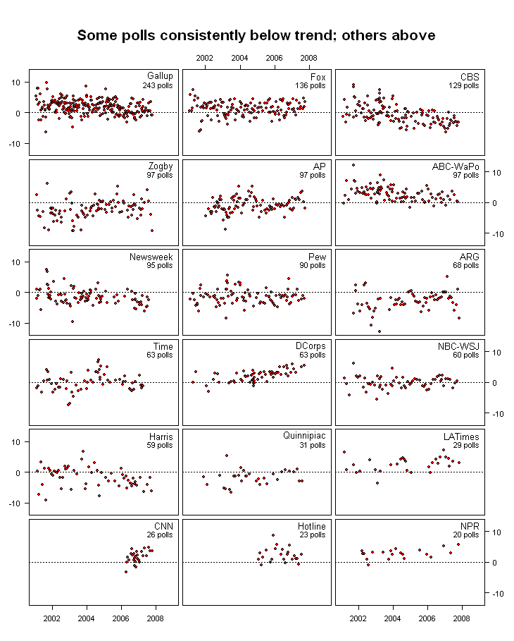
The table below shows the mean residual difference between each poll and the average poll. That is, on the whole, the Fox poll shows about a 5 point larger difference in approval-disapproval spread than the average of all polls; while the Zogby poll reports about a 10 point lower difference in spread than the average of all polls.
|
Please see my comparison of poll bias in both Bush's job ratings and the Bush vs. Kerry election matchup.