This page describes the detailed analysis supporting the overall conclusions made here. Topics covered in this page include:
Although the mean wattages reported from these three devices appear similar, we have already observed that the distribution of power appears different. Do those differences vary in systematic ways? These data suggest that:
The graphs below plot average power against reported differences. The left panel compares the SRM and the Polar, the right panel compares the SRM with the Power Tap. A third plot (comparing Polar and Power Tap) is omitted, but the comparison is consistent with the two that are shown. These plots are known as Tukey Mean-Difference plots (and to Andy Coggan as Bland-Altman plots). A dot in each plot shows the difference in wattage reported as the wattage levels increase. A dot above the horizontal line means that the Polar (or the Power Tap) reported a higher wattage than the SRM at that point, while a dot below the line means that the Polar (or Power Tap) was reporting a lower wattage than the SRM. I have superimposed on each plot a locally-weighted regression line to highlight how reported power varies with power level. This locally-weighted line summarizes whether there is any drift in the reported power (compared to the SRM) at different power levels.

Two immediately discernible characteristics of the left-hand panel, which compares the SRM and the Polar, are: 1) the asymmetry of zero-wattage reporting (there is a downward-sloping line of points that represents zero-wattage readings from the Polar where there are no corresponding zero readings from the SRM), and; 2) the dip at low wattages where the Polar tends to underread the SRM. At the same time, the red line is horizontal from about 150 watts on up, showing that the Polar and the SRM agree very closely above that level. The red line reinforces what we had observed earlier, that the Polar tends to censor wattages below about 50 or so. What we had not previously observed was a slight tendency for the Polar to read high (relative to the SRM; alternatively, the SRM may be reading low) near 100 watts.
The right-hand panel compares the SRM and the Power Tap. Unlike the panel on the left, the green line appears to drift almost linearly downward, at a slope of about 10%. This means that, in these data, the Power Tap tends to read lower than the SRM and does so at approximately the same ratio as power increases.
As a reminder, these data cannot tell which device is "right" since there is no external check on accuray; they can only reveal patterns of difference. For example, both the Polar and the Power Tap agree in reading slightly higher than the SRM in the neighborhood of 100 watts; that could mean that the SRM is reading low, rather than the other two reading high. There is also some reason to believe that the Power Tap ought to report wattages slightly lower than the other two. The Power Tap measures power at the rear hub, and is therefore downstream of drivetrain losses, while the SRM measures power at the crank. I do not know how efficient Adam's drivetrain is, but a generally accepted ballpark figure for drivetrain losses is about 5%, or about half of the observed difference. The green line appears consistent with our finding that the mean wattage for the Power Tap was lower than that of the SRM or the Polar, but it provides more information than the table--it tells us that the difference is linear with increasing power.
Notes on the analysis. This analysis was nontrivial because of the different reporting periods of the SRM (2 seconds), the Power Tap (nominally, 2.52 seconds), and the Polar (5 seconds). In order to do this comparison, I had to standardize the reporting intervals. One way to do this is to interpret the Power Tap and Polar readings to 2 second intervals to match the SRM. In contrast, I chose to create a 10-second average for each of the three devices (i.e., I averaged 5 consecutive SRM data points, 4 consecutive Power Tap data points, and 2 consecutive Polar data points). These are the basis for the mean-difference plots shown here. I do not think this insupportably biases the results, but I welcome your revised analysis of the data if you disagree. The locally-weighted regression method is called lowess and the local span parameter was set at 0.125.
Because the Polar measures wattage via chain tension and chain speed (a method unfamiliar to many users), there has been speculation that the Polar's readings may be sensitive to extreme gear ratios or chain angles. In order to look at these possibilities, it is first necessary to examine the speed and cadence reported by each device. The graph below shows the raw and unsmoothed speed (in kph) reported by each device for the first hour of the ride (this corresponds to the earlier plot of raw and unsmoothed wattage for the first hour of the ride). The speed reported is so consistent that it appears that there is only one line.

In contrast, here is the cadence (in rpm) reported by each device:
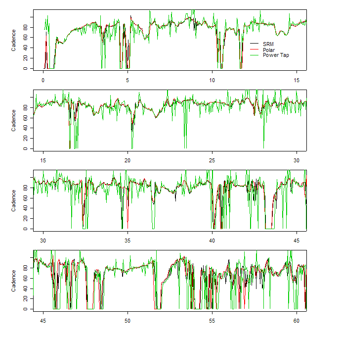
It is evident that the cadences reported by the SRM and Polar are far more consistent with each other than those reported by the Power Tap. The SRM and Polar calculate cadence by the use of a magnet on the crank, while the Power Tap calculates its cadence by analyzing torque variation received by the hub (if torque is maximized at the 3 o'clock and 9 o'clock positions of the crank, and minimized at 6 and 12 o'clock, one can use the variation in torque to count crank revolutions). In fact, in these data (as well as in other data I have collected) it is apparent that the Power Tap algorithm for calculating cadence is flawed. If one is uninterested in cadence, the Power Tap's way of measuring cadence may be unimportant; however, as we shall see in the next section, it is essential to examining power by gear. Before moving to that section, however, here is a plot that shows the relationship between speed and cadence for the three devices. The top two panels show data for the SRM and the Polar, and one can clearly see a pattern of bands in the data, which will be explained below. The lower panels show data from the Power Tap. You will be able to distinguish three differences between the Power Tap graphs and the top two:

These differences in rpm prompted a slightly more detailed look for holes and heaps in speed, cadence, and in the Power Tap's case, torque. Immediately below is displayed a series of histograms for each of these variables. Regular holes in the speed recording for the SRM and Polar indicate imprecise conversion between analog and digital signals. The Power Tap appears not to suffer speed holes, but speed changes are much more "steppy."

The cadence recorded by the SRM and Polar appear roughly similar, but the oddities of the Power Tap are evident.

The third graph shows that holes appear in the Power Tap's torque recordings, too, similar to the speed recorded by the SRM and Polar.

What causes the diagonal bands in the graphs of speed vs. cadence? Those bands show the gears used during the course of the ride. It is well-known that given the cadence, the gear ratio, and the tire circumference, one can calculate the speed. In this case, we are given the speed and cadence so we can backsolve to get the gear ratio if we make a good guess at tire circumference. In the graph below, I have plotted estimated gear ratios, g, based on the SRM's speed and cadence information and an initial guess of tire circumference of 2.1 meters (most 700c wheels have a circumference close to 2.1 meters).

Each dot shows the gear ratio used during a 2-second interval and the discreteness of the gear choice is clear. The discrete pattern is determined by the chainwheel and cog combination used and, since chainwheels and cogs have an integer number of teeth, only a finite number of bands can occur when the rider is pedaling (rather than coasting). If the rider coasts for 1 second and pedals for 1 second, the average cadence will be halved and the calculated gear ratio will be inflated, which is why not all points lie directly in-line with exact gear ratios. In fact, one can often do better than these estimated gear ratios--because the teeth of chainwheels and cogs are integers, each chainwheel-cassette combination has a distinctive pattern, much like chemical compounds can be uniquely identified by looking at a mass spectrogram. From earlier data supplied by Adam Hodges Myerson, I was able to determine that he uses chainwheels of 52 and 38 teeth, and a 12-25 cassette. In order to analyze the effect of cross-over gearing, one must identify the chainwheel and cogs. Of course, this problem is much simpler if one is analyzing one's own data (since you will already know your chainwheels, cogs, and tire circumference). I have labeled three bands by the chainwheel-cog combination, and point out that with these data it is possible to distinguish a chainwheel-cog combination of 52x21 (gear ratio of 2.48) from a 38x15 (gear ratio of 2.53).
I was surprised to see how well this gear estimation worked and to the best of my knowledge no other analysis of has been published using data such as these. This technique works well enough that it is possible to determine the chainwheels and cogs used by Bjarne Riis during the 1997 Amstel Gold World Cup race using the sample data file included with the SRM software (http://www.srm.de). I leave that as an exercise to the reader.
The graph below shows the calculated gear ratios against the reported wattage for the three devices. The panels demonstrate that analyzing Power Tap data for power patterns by gear may be unfruitful because of the cadence issue already noted. The lower right-hand panel superimposes the calculated gears reported by the SRM and the Polar over a 15-minute interval, and demonstrates their consistency (as was expected by looking at the speed and cadence data).

The graph below superimposes the SRM and Polar watt-by-gear data (with the gear ratios translated into gear-inches). To deal with the different reporting intervals, in this graph I have paired the SRM data point closest to the Polar data point in order to equalize the number of observations. This graph demonstrates that, with the exception of the Polar's tendency to drop low wattages down to zero, there does not appear to be substantial bias by gear ratio between the two.

Exact comparisons between meters is complicated by the fact that each device calculates and displays wattage in slightly different ways. For example, the Power Tap uses a shorter averaging interval than the Polar, so if one were trying to measure maximum wattage, the Power Tap may report a higher figure even if the underlying wattage (when averaged over equivalent periods) was the same. In addition, note that the "natural" recording interval of the Power Tap is 1.26-seconds; the 2.52-second recording interval is not an average over the preceding 2.52 seconds (in fact none of the three devices averages over intervals equal to the recording interval). The Power Tap's 2.52-second recording interval doubles storage capacity by ignoring every other 1.26-second record.